
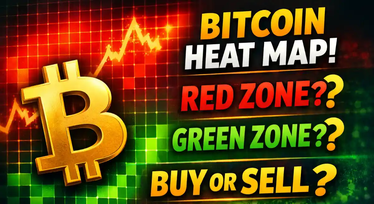
Bitcoin Heat Map Explained: What Red and Green Zones Mean for Traders
In the high-stakes world of Bitcoin trading, where markets move at lightning speed and billions can be liquidated in hours, a new class of analytical tools is giving traders a critical edge. Among the most powerful are Bitcoin heat maps, which transform complex market data into intuitive visual forecasts. These maps do more than just track price; they reveal hidden layers of market sentiment, leverage, and vulnerability, acting as a radar for impending volatility. For the savvy trader, understanding the language of colors on these maps—particularly the ominous red zones and the magnet-like green clusters—can mean the difference between catching a major move and being swept away by a liquidation cascade.
Beyond the Candlestick: What is a Bitcoin Heat Map?
A Bitcoin heat map is a sophisticated data visualization tool that uses color intensity to represent trading activity, order concentration, or risk levels across different price points. Unlike traditional candlestick charts that only show the open, high, low, and close, heatmaps illuminate what’s happening beneath the surface of the price action. They answer critical questions: Where are large orders clustered? At what price levels are traders most vulnerable? Where is the market likely to head next based on pure supply and demand mechanics?
There are several types of heatmaps, but two are paramount for active traders:
1. Liquidation Heatmaps: These show where large numbers of leveraged long and short positions are at risk of being automatically closed by exchanges. They are perhaps the most directly actionable for predicting volatility.
2. Order Book/Activity Heatmaps: These visualize the density of limit buy and sell orders resting at various price levels, helping to identify robust support and resistance zones based on actual trading intent rather than just historical price points.
Decoding the Colors: Red Zones vs. Green Zones
The color schemes can vary by platform, but a common and critical interpretation revolves around red and green zones, especially within liquidation heatmaps.
The Danger of Red Zones: Liquidation Clusters
In a liquidation heatmap, red or bright yellow zones typically indicate areas of extreme danger and opportunity. These “hot” zones represent price levels where a high concentration of leveraged positions will be forcibly liquidated.
What they signify: A bright red zone above the current price suggests a dense cluster of short positions waiting to be liquidated. If Bitcoin’s price rallies into this zone, it can trigger a short squeeze, forcing those sellers to buy back Bitcoin to close their positions, which ironically fuels further upward momentum. Conversely, a red zone below the price signals a pool of over-leveraged long positions that could be wiped out in a downturn, potentially accelerating a sell-off.
Why they act as magnets: Price has a gravitational pull toward these liquidity pools. Large players and market-making algorithms are often aware of these clusters and may push the price toward them to trigger these liquidations, profiting from the resulting volatile move. This is why traders say liquidity “acts like a magnet.”
The Signal of Green Zones: Support, Resistance, and Balance
Green or blue zones on a heatmap generally indicate areas of significant trading activity that form key support or resistance. On an order book heatmap, a green band might show a high volume of historical buy orders or a current concentration of limit bids.
What they signify: These are zones where the market has previously seen a strong agreement on value. A green support zone below the price is where buyers have consistently stepped in. A green resistance zone above is where sellers have historically emerged. On a liquidation heatmap, cooler colors like blue or green indicate areas with relatively low liquidation risk, often representing quieter price territories.
The Trader’s Playbook: Practical Strategies Using Heat Maps
Understanding heat maps is one thing; applying them profitably is another. Here’s how traders integrate this tool into their strategies.
Anticipating Volatility and Spotting Reversals
The primary use is anticipating where the next big move will originate. Traders monitor the distance between Bitcoin’s current price and the nearest major liquidation cluster (red zone). As the price drifts closer, the probability of a sharp, volatile spike into that zone increases dramatically. These zones can also pinpoint potential reversal points. For instance, if price surges into a massive short liquidation zone (red above price), the subsequent liquidation cascade may exhaust the selling pressure, leading to a local top and reversal.
Refining Entry, Exit, and Risk Management
Heatmaps provide a data-backed method for placing orders.
Entries: A trader might place a buy limit order just below a major green support zone identified on an activity heatmap, anticipating a bounce. Alternatively, a trader may place an order to sell the rally just below a dense red liquidation zone above price, predicting a rejection.
Stop-Losses: Heatmaps help avoid the fatal error of placing a stop-loss in a high-liquidity zone. If many traders have their stops clustered at the same obvious level, it becomes a target for a stop hunt. Placing stops away from these bright heatmap zones can reduce the risk of being taken out by mere market noise.
Take-Profit Targets: The edge of a major opposing liquidation zone often serves as a logical take-profit target, as price may reverse upon reaching that magnet.
Combining Heatmaps with Classic Technical Analysis
The true power of heatmaps is unlocked when they confirm signals from other tools. A classic resistance line on a chart is far more significant if it aligns with a bright red liquidation band. A bullish breakout from a chart pattern is more convincing if it’s headed directly toward a large liquidity pool above. This confluence of factors—heatmap data with traditional technical analysis—creates high-probability trading setups.
Essential Tools and Platforms
Access to reliable heatmap data is crucial. Several platforms offer these visualizations, often with unique features.
• Coinglass: A popular destination for liquidation heatmaps across multiple cryptocurrencies and exchanges, providing a broad market view.
• Glassnode Studio: Offers advanced on-chain and derivatives metrics, including sophisticated liquidation heatmaps that use data from transparent exchanges to model risk across the market.
• Bookmap: Originally for traditional markets, it provides exceptionally detailed order book heatmaps, visualizing limit order flow in real-time to show where institutions are placing their bids and asks.
• Exchange-native Tools: Some derivatives exchanges like Bybit and Binance have begun integrating basic liquidation heat data into their platforms for users.
The Limitations and the Big Picture
While powerful, heatmaps are not a crystal ball. They are best used as a contextual tool, not a standalone system. Liquidation clusters can shift as traders open or close positions, and a zone that appears dense today may dissipate tomorrow. Furthermore, in ranging or low-volatility markets, heatmap signals can be less reliable.
The most successful traders use heatmaps to understand the mechanics and psychology of the market—to see where leverage is piled, fear is concentrated, and liquidity awaits. In the relentless, algorithm-driven crypto markets, this insight is invaluable. It transforms trading from a game of reacting to past price movements into one of anticipating future market mechanics, providing a tangible edge in the pursuit of profitable decisions.
FAQs
What is a Bitcoin heat map?
A Bitcoin heat map is a visual trading tool that uses colors to show where trading activity, liquidity, or liquidation risk is concentrated at different price levels. It helps traders quickly spot important zones that may influence future price movement.
What do red zones mean in crypto heat maps?
Red zones indicate areas of high risk and high liquidity, where many leveraged positions are likely to be liquidated. When price reaches these zones, sharp and fast moves often occur due to forced buying or selling.
How do traders use liquidation heat maps?
Traders use liquidation heat maps to identify where large clusters of long or short positions exist. These zones help traders anticipate volatility, plan entries and exits, avoid stop-loss traps, and target areas where price is likely to move next.


")